Cloning Zwift on iOS Part 4: Workout View
I haven’t been working as much on my workout app since it’s been good enough for me to use as a replacement for Zwift with the most recent changes I wrote about.
I got a new iPhone so I had to build and install the app on my phone again, and after firing up Xcode I decided to go ahead and add a few more things that I was meaning to add to the app. The app hasn’t had a good visualization of workouts so I ended up creating an interface for that.
Taking cues from Zwift
I didn’t want to reinvent the wheel here, so I decided to just copy how Zwift shows workouts, because it works pretty well. Not that I’m trying to write a whole 3d cycling MMORPG, but it helps to know where I am in a workout besides time elapsed and time remaining.
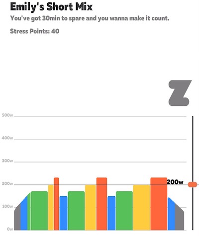
The general idea is to code each segment with its color based on the difficulty zone, and its height based on the target wattage of that segment.
I previously noted that the target wattage of a segment is based on the product of your own FTP and a multiplier. I did some reverse engineering and found that the color coded “zones” are based on this formula:
- 0-60% = zone 1
- 61-75% = zone 2
- 76-89% = zone 3
- 89-104% = zone 4
- 105-118% = zone 5
- 119%+ = zone 6
I then just mapped the zones with the same colors, with zone 1 being gray, 2 being blue, etc. For the warmup and cooldown segments I just take the high power of those segments.
Creating a View
Creating custom views from scratch is really not my strong point, but I know enough about autolayout and UIKit to implement whatever views a designer throws at me. Unfortunately I don’t have designer to throw designs at me so I had to come up with something on my own.
I was originally going to use a .xib file and set things up programmatically, but I realized that I really didn’t need a .xib and could do everything programmatically. I usually go with a hybrid approach to make the complicated parts easier, but in this case doing stuff in code is actually less complicated.
I ended up going with a stack view based layout, where I inserted the views into a horizontal stack view. The view itself has a width anchor based on the percentage of time it takes (if it’s a 10 minute segment in a 30 minute workout then its width would be 33.3% of the container), and then a subview which has a height anchor based on the relative intensity of the segment. It works out pretty well.
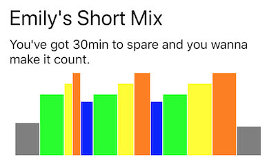
I threw the view into a UITableViewCell so I could visually get a clue what the workout I was selecting looks like:
Finally Some Progress
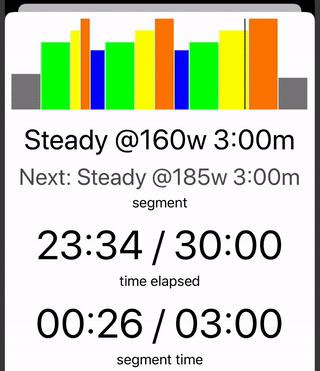
I was pretty happy with the stack view representation of the workouts and left it that way for a few months. Today I was refactoring some stuff and implemented something that was really bothering me for a while. In Zwift you get a really nice view of the upcoming segments, and where you are in your current segment. My app is not really good at this, and there was a bug where it not correctly display the upcoming segment sometimes because of the way it handled workout segment equality. Essentially it was looking for the index of a segment but if there were two exact same segments it would assume the first one was the correct one.
Anyway, I fixed that bug by just tracking the actual index of the segment I was on.
The other thing I wanted to add was a progress view, so I broke the Workout view into its own class and added a “progress” indicator, which is just a horizontal slider that slides over as you’re working out.
This is what it looks like, if I was working out at 10x the regular speed (which would be easier I guess).
That’s about it for now! I think this makes my app pretty usable and until I find another thing I need to add to it, I feel like this is a good replacement for Zwift. If you happen to need the exact same thing that I do and also happen to have the same exact exercise bike, feel free to clone the Github repo and use the app!
Leave a Comment
Comments are moderated and won't appear immediately after submission.
Thank you for your comment!
Your comment has been submitted and will be published after manual approval.
Submission Error
There was an error submitting your comment. Please try again.