foursquare 2.0 UX Sloppiness
Foursquare just released a new version of its iPhone app.
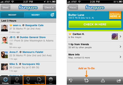
Something I noticed right away which disappointed me was that they basically slapped on a new view to the existing app, and didn’t even bother to match the style of the original app!

Not only is the new bar a different color, it’s also a different height than the existing one! It also lacks labels where the original one has labels below the icons. This is simply sloppy design. These two screens exist in the same version of their app! It wouldn’t have taken much more work to either update the app so both bars are grey, or match the new views to the old one.
I recently saw that foursquare is looking for a new Product Manager. I’m considering applying to help them out with their product issues 🙂
EDIT:
After emailing back and forth with Alex Rainert, foursquare’s head of product, it seems that, to answer my own question, this was a conscious design decision to change the visual style of the buttons. In one context, they are for navigating various top level features, and in another, they are buttons for various pop-up actions. It’s of my opinion that the change in visual style is a bit too much (the change in height along with the loss of the location footer in some screens), but that’s a design choice that foursquare made intentionally.
