Cloning Zwift on iOS Part 5: SwiftUI and Combine
I recently switched teams at Amazon to one that is using SwiftUI and Combine, so I finally have a good excuse to learn the two. I am somewhat familiar with Functional Reactive Programming from using RxSwift at Lyft, but I’ve only really dabbled a bit with SwiftUI.
I decided to spend some time last weekend (and this weekend) rewriting most of my Zwift clone app to use SwiftUI and Combine, and here’s some of the stuff I learned along the way.
Moving to Combine
When I originally wrote the Zswift app, I didn’t really spend too much time on making sure the data model or architecture was the cleanest or anything. It’s really more of a hodgepodge of explorations and trying to get stuff to just work. Because of this, I probably violated a bunch of best practices. I had a “Workout” object that stored all of the different information that is needed to model a workout, but I also threw a bunch of logic and functions in there that probably didn’t make sense.
For example, the Workout had info on each segment of the workout, along with the duration and amount of power for the segment. As the workout progressed, I would store the elapsed time as well as a bunch of other state variables like the current segment and other variables like time in current segment that I used to drive the UI. Since I kept a bunch of variables to keep track of state, it’s possible that some of them would get out of sync with each other, and that would cause bugs. I think I had a bunch of off-by-one errors where I would reach the end of an index and crash or the time within a segment would be off by 1 so I’d be at 2:01/2:00 as far as progress went. Those kind of bugs.
In moving to Combine, my goal was to have the state of the workout flow from the one thing about the workout that actually changes: the elapsed time.
The elapsed time literally decides which segment I’m in, how long I’ve been working out (duh), how long I’ve been in the current segment, how hard I should be pedaling, etc. I ended up creating a separate class to keep track of the state of the workout, and just use the workout as a static definition of the workout. I could’ve done this before migrating to use Combine, but like I said, it was working and I didn’t feel the need to refactor.
In my current setup, the WorkoutManager has a @Published variable that keeps track of the elapsed time, and then I create a bunch of other publishers based on that one. I also have publishers that combine (imagine that) with other publishers. For example, I have a publisher called “timeInCurrentSegmentPublisher” that publishes the amount of time that I’ve been in the current segment. I combine this publisher with the “currentSegmentPublisher” which gives me the current segment, and use this to calculate the percentage progress for the current segment. I have to combine the two because each publisher only gives me one thing.
I weighed the benefits of creating publishers with multiple tuples of values, but in most cases it didn’t make sense, and I think it goes against the concept of making the streams composable, but I did end up making one for currentSegmentPublisher since it calculates the current segment and the current segment’s index at the same time anyway. Even as I’m writing about it now, I’m not sure if the better way is to create two different publishers since it’s kinda clunky to grab the desired value from the tuple.
Anyway, the result here is that my Workout object doesn’t have any more state at all. I could make it a struct but there’s some SwiftUI requirement for my Workout to be a class if I want to use it in a Modal view (which the workout detail is set up as) so for now I’ll just leave it as-is. I could also create a view model if I really wanted the Workout object to be a struct.
I’m sure I could optimize the Combine publishers even more but since they’re working now I’ll just leave them.
SwiftUI
The general opinion that I see from others about SwiftUI is that the more people use it, the more they like it, and that it really forces you to rethink how you define interfaces. I heard this a million times but until you actually play around with it in a non-trivial example I feel like it’s hard to really understand it.
The gist is that SwiftUI is a declarative way to define your UIs instead of an Imperative way. The difference can seem subtle until you start doing stuff. What it means is that instead of telling the computer how to do something, you just tell it what you want. If that’s confusing then yeah, actually it is confusing.
I guess to put it another way, in UIKit you can define views as objects, give them properties, add them to a parent view and then set some constraints on them. In this imperative example, it’s up to you to define every step to the computer to tell it what to do, and hope that your interface matches what you were thinking.
In a declarative syntax, you can describe what you want, and add some modifiers to it if you need to have more control over the actual output. From there, you also define state variables or observed objects that the SwiftUI view will use to actually come up with the completed interface.
Imagine that you want to show a list of dog breeds. In an imperative system you need to set up the collection view controller, fill out your functions for “cellAtIndex” and “didSelectCellAtIndex” etc, and supply the cells. In a declarative system you can say “I want a list of ‘DogViews’ that use the ‘Dog’ model” and define a “NavigationLink” to define what happens when you tap on the cell.
The interesting part to me was that the SwiftUI view is an immutable struct, so you can’t modify the view as you would a UIView when states change. Of course your view can respond to changes in the data model, but all of those states need to be determined at compile time rather than runtime.
One of the best parts about SwiftUI is how the “live” previews work. They aren’t exactly real time, but fast enough that the feedback loop between writing UI code and seeing the result is very tight. In the past I’ve had to write code to update a UI (or use Interface Builder), then build and run, and go to the part of the app where the UI I changed was. This could mean it would be a few seconds or minutes before I saw whether the change I just wrote actually worked. In SwiftUI you make a change and once you’re done writing it, the preview window will show it. The system isn’t perfect, of course, as sometimes it can’t compile and you need to reenable the live preview. But it’s really the best tradeoff between the WYSIWYG style of Interface Builder and the readability of programmatic view code. I’m sure the tools will improve in the future, and I’m quite certain that this ease of previewing code will be one of the factors that will motivate people to switch to SwiftUI.
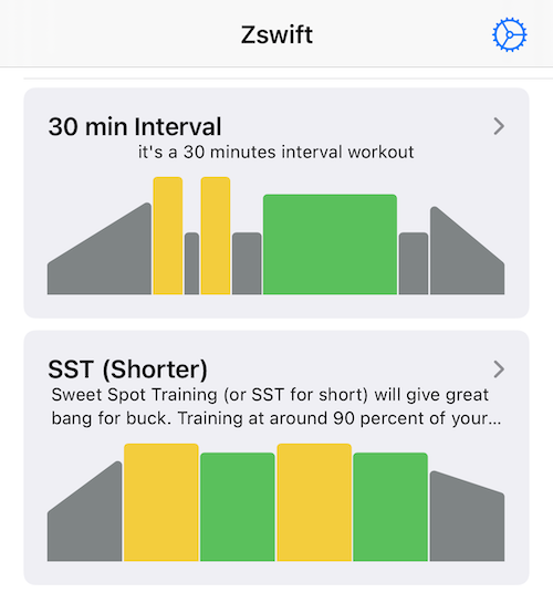
The Workout View

I modeled my original interface after the Zwift app. In the Zwift app, you can see the workout represented as a bunch of rectangles representing segments that get taller when the target power is higher. The width is determined by the length of the segment.
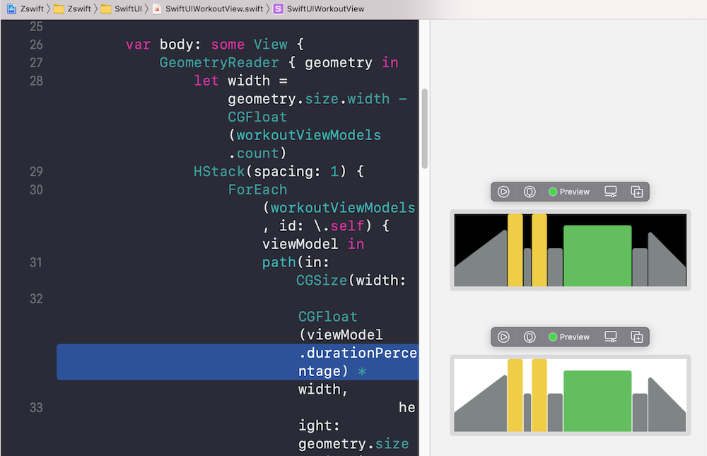
I basically copied this and implemented it with a UIStackView and percentage constraints. I thought it was pretty cool but one thing that bothered me is the warmup and cooldown segments. Those have a starting value and ending value that are different (warmups start lower and end higher). I didn’t want to spend too much time drawing the start of the rectangle to be lower than the end (plus it wouldn’t technically be a rectangle at that point) so I just used the “lower” value and set them as flat rectangles.
I decided to practice some custom drawing in SwiftUi to properly draw the warmup and cooldown segments and I’m pretty happy with the result. The view is drawn by taking the desired start and end heights and width, and drawing a path with it. I used “path.addArc” to get a nice rounded corner effect, though it isn’t perfect. I also draw a 1px wide vertical line to show where I am in the workout by offsetting it from the left by a percentage of the view’s width.
I also went ahead and stole the color scheme from the Zwift app which makes it look a bit more polished.
The Workout Detail
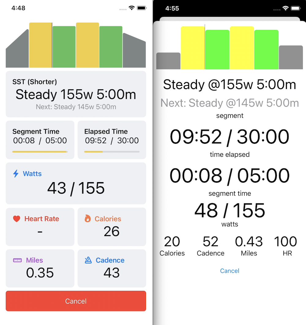
In addition to updating the workout representation view, I also decided to just overhaul the entire workout detail view (the view I see when I’m in a workout). The old interface was pretty basic with a bunch of grids and text boxes that didn’t really have any visual separation from each other, aside from the size and distribution of the labels.
I ended up experimenting with the “GroupBox” component of SwiftUI which is pretty simple but makes a big difference just in terms of separating out the different interface elements. I also added some accent colors and icons to some of the text labels, and I added progress indicators to the segment time and elapsed time sections just to make them stand out more. Overall I really like the new workout detail view which is good since I’m literally the only person who uses this app.
I have some more ideas for enhancements, like recreating the Apple Watch heart rate animation which shows a heart pulsing at your actual heart rate. The animation seamlessly updates when your heart rate changes, which is pretty cool.
I also want to add some more tracking informtion, like a histogram (maybe with candlestick charts or sparklines) of the wattage and heart rate info. This would be nice to have but the HealthKit integration already includes the heart rate chart. And I don’t know if I care too much about the wattage graph.
Leave a Comment
Comments are moderated and won't appear immediately after submission.
Thank you for your comment!
Your comment has been submitted and will be published after manual approval.
Submission Error
There was an error submitting your comment. Please try again.