When Interaction Design Goes Bad: Airport Terminals
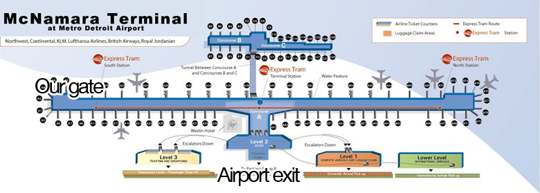
I recently flew into the Detroit airport McNamara Terminal, and I made an observation that most of my fellow travelers probably made as well. That particular terminal consists of two long sides that branch out of the middle of the terminal. Our flight taxied to just about the farthest you can possibly be from the exit of the airport. Everyone had to walk across the furthest path (or take the tram) to get to the baggage claim and the airport exit. Why?
I read somewhere that airports used to get a lot of complaints about the baggage claim taking too long to get started. Travelers would have to wait at the carousel thing and probably got really bored. To fix that, the airports would drop people off at further gates, making them walk further. This longer walk caused the “wait time” at the baggage claim to be shorter, and they got less complaints. Perhaps that’s what happened to me and my fellow travelers.
I would argue that the particular “fix” I described probably shouldn’t be used anymore. Since most airlines charge people to check in bags, I think many don’t even need to wait at the baggage claim anymore (myself included). The fix is an interesting psychological trick, but it doesn’t actually buy anyone time, and it just makes me take longer to get out of the airport. I’d argue that this is interaction design gone bad, but I don’t have a way to confirm that this strategy is the reason we were dropped off so far from the exit. The flight was getting in at 10:30 and we passed numerous free gates, so I can’t think of any other good reason (maybe to save the plane some fuel?).
